
5.3: Build A Fluid Lesson
A fluid presentation behaves more like a web lesson than a fixed canvas. Its page height can grow with the content, while a maximum width keeps long lines and large media from stretching indefinitely on wide screens.
Fluid layout is useful for reading-focused lessons, responsive content, and pages whose length varies. It does not automatically repair fixed-position objects from an existing slide presentation.
1. Switch To Fluid Layout
- Open the presentation in the editor.
- Select Design in the top bar.
- Expand Layout if it is closed.
- Under Type, select Fluid (Web-like).
- Choose Freeform or Auto Layout under Positioning according to how the content should be arranged.
The type change applies to the whole presentation. Duplicate important work before a major conversion when you need to preserve the original fixed layout.
2. Set The Maximum Content Width
Open Max Width and choose the largest width the lesson content should occupy.
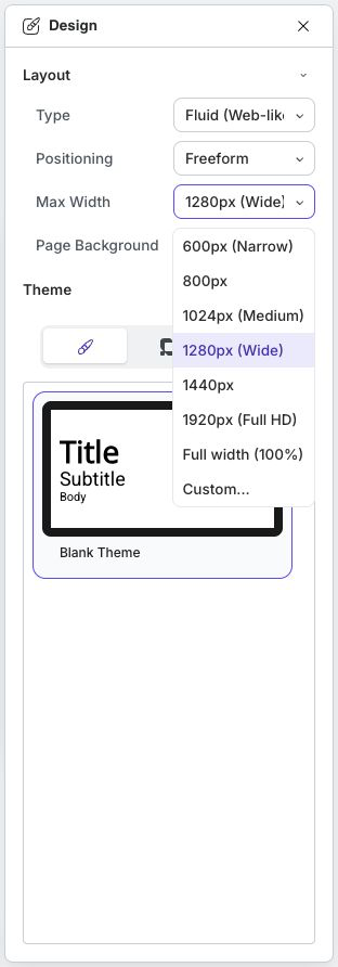
| Option | Good starting point for... |
|---|---|
| 600px (Narrow) | Focused reading columns |
| 800px | Compact lessons with text and small media |
| 1024px (Medium) | General responsive lesson content |
| 1280px (Wide) | Mixed text, media, and multi-column content |
| 1440px | Wide desktop compositions |
| 1920px (Full HD) | Content designed for large displays |
| Full width (100%) | Layouts intended to use all available width |
| Custom... | A specific width from 320 to 3840 pixels |
Maximum width is a ceiling, not a forced device width. On a narrower screen, the player has less horizontal space and the content must still be able to shrink or wrap.
3. Build For Responsive Reading
- Prefer Auto Layout and container groups for content that should reflow.
- Keep text blocks readable instead of stretching one line across the full screen.
- Use group Row, Column, column, and tile layouts deliberately; test what happens when horizontal space becomes limited.
- Avoid relying on many overlapping freeform objects. They can collide when the available width changes.
- Check media sizing and text wrapping after adding or replacing content.
- Use Page Background for the page surface, then check contrast at both narrow and wide widths.
Fluid height expands to fit content, but an object can still overlap another object if both use positions that do not participate in the same automatic layout.
4. Preview The Learner Experience
Select Present after every meaningful responsive-layout change.
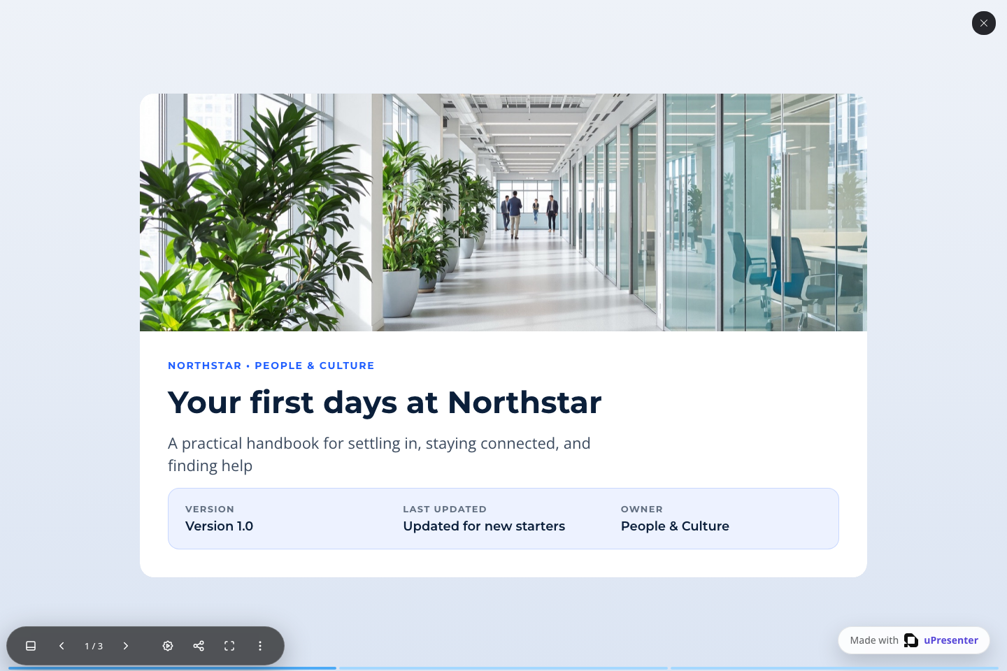
The Employee Handbook example starts with a wide image and continues with reading-focused pages inside a fluid presentation. Move through its pages and check that each section stays readable as its content grows. If content converted from a fixed slide overlaps, return to the editor, move the affected objects into suitable containers, choose an automatic group layout where appropriate, and preview again.
Check at least these conditions:
- The first page loads without clipped content.
- Text wraps without covering media or controls.
- The page can grow vertically and remains easy to scroll.
- Grouped content stays in the intended order.
- Questions, interactions, and player controls remain usable.
- The last content on each page is visible before the player navigation area.
If your browser-testing workflow supports different window sizes, repeat the preview at a narrow and wide width. A correct desktop editor view is not proof that the learner view is responsive.
Quick Check
Before continuing, make sure that you can:
- select Fluid (Web-like);
- choose a useful maximum width;
- explain why maximum width is not a fixed viewport width;
- arrange content so it can wrap or stack; and
- use Present to find and correct overlap or clipping.
Previous: Use A Fixed Slide Layout · Next: Arrange Content With Group Layouts · Back to Part V · Back to the full guide