
9.1: Create And Edit Charts
Charts help learners compare values, notice trends, and see relationships that are harder to recognize in a list of numbers. A useful chart begins with a clear question and clean data, not with decoration.
In this section, you will choose a chart type, edit its data, import a data file, and change the chart type without rebuilding the object.
Before You Begin
Open a presentation and select the destination slide. Prepare short category and series names, remove totals that would duplicate the values being charted, and decide what the learner should notice first.
1. Choose A Chart Type
Select Charts & Tables in the editor toolbox. The Charts group provides Create with AI, Bar, Column, Pie, Doughnut, Line, Polar Area, Radar, Scatter, and Bubble.
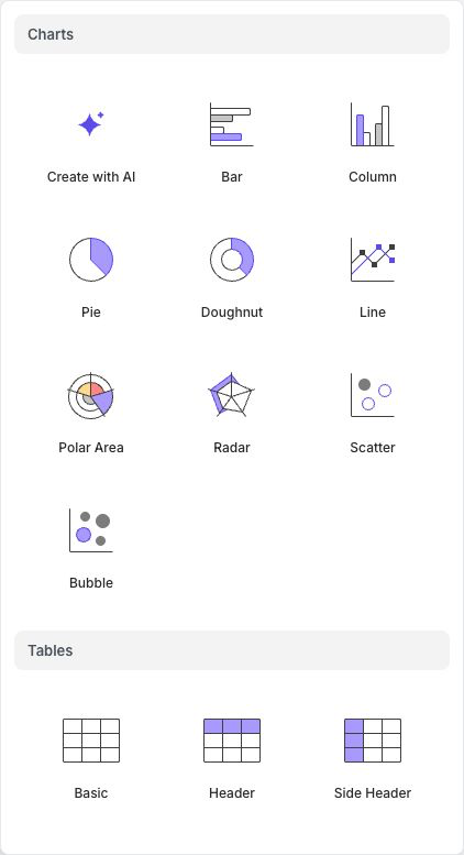
Choose the form that best matches the data:
| Chart | Best used for |
|---|---|
| Bar | Comparing categories when labels are long or horizontal reading is easier |
| Column | Comparing categories or a short sequence vertically |
| Pie or Doughnut | Showing a small number of parts that make up one whole |
| Line | Showing change across an ordered sequence, often time |
| Polar Area | Comparing magnitudes around a circular scale |
| Radar | Comparing several measures across one or more profiles |
| Scatter | Showing the relationship between two numeric variables |
| Bubble | Showing two numeric variables plus a third value represented by bubble size |
After you select a type, uPresenter inserts and selects a chart on the slide. Resize it before making fine typography decisions so you can judge the final label spacing.
Start With AI
Select Create with AI when you want a first draft from a description. State the subject, the values or comparison, and the chart form you want. Treat the result as an editable draft: verify every value, label, title, and conclusion before using it in a lesson.
2. Edit The Chart Data
Select the chart, then select Edit Data in its floating toolbar. The Edit Chart Data dialog contains the chart title and a spreadsheet-like grid.
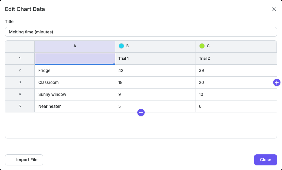
Use the grid as follows:
- Edit the title above the grid.
- Enter category labels in the first column.
- Enter each series name in its colored column heading.
- Enter the numeric values in the body of the grid.
- Use the round + button below the last row to add a category. For chart types that support multiple datasets, use the round + button beside the last column to add a series. Both buttons show an icon only; their tooltips read Add Row and Add Column.
- Select Close when the data is correct. Changes are applied as you work.
Pie, doughnut, and polar-area charts use a single dataset, so the Add Column button is unavailable for those chart structures. For scatter and bubble charts, keep each point's numeric coordinates—and bubble size where applicable—together in the expected dataset.
3. Import Data From A File
In Edit Chart Data, select Import File, then choose a CSV, TSV, or XLSX file. Import replaces the chart's current data, so check the source first.
For bar, column, line, pie, doughnut, polar-area, and radar data, use a simple rectangular layout:
- the first row contains the series headings;
- the first column contains category labels; and
- the remaining cells contain values.
Scatter data is arranged in X/Y column pairs for each dataset. Bubble data is arranged in X/Y/size column groups. Put each dataset name in the first heading cell of its group and make sure the total number of data columns divides evenly into pairs or groups of three.
For XLSX files, uPresenter reads the first worksheet. Blank rows are ignored. After a successful import, inspect the grid for shifted headings, missing values, or numbers stored as text before closing the dialog.
4. Change The Chart Type
Select the chart and use Chart Type in the floating toolbar, or open Properties and use the chart type under Classification. The existing chart object remains in place while its visualization changes.
Recheck the data after changing between category charts and coordinate-based charts such as Scatter or Bubble. A layout that is meaningful for columns may not provide the numeric X, Y, or size values required by another chart family.
5. Make The Chart Understandable
Give the chart a title that states the comparison or takeaway. Keep legends close to the data, avoid more series than learners can distinguish, and use data labels only when they add useful precision. Do not rely on color alone; Decal patterns can help distinguish series, and a nearby text summary or table gives learners another way to access the result.
Use Present to check that labels remain legible at the learner's expected screen size.
If The Chart Does Not Work As Expected
| What you see | What to do |
|---|---|
| The Add Column button is unavailable | The selected chart structure uses one dataset. Choose a multi-series type if the comparison needs several series. |
| Imported headings or values are misplaced | Put headings in the first row, labels in the first column, and remove decorative blank rows or merged cells from the source. |
| An XLSX import uses the wrong data | Move the intended data to the workbook's first worksheet, save, and import again. |
| Labels overlap | Enlarge the chart, shorten labels, move the legend, or show fewer categories. |
| A changed chart type looks misleading | Return to Edit Data and reshape the data for the new chart family, or choose a type that matches the original structure. |
Quick Check
Before continuing, make sure that:
- the chart type matches the question the data should answer;
- every imported or AI-generated value has been verified;
- the title, category labels, and series names are meaningful;
- labels remain readable in Present; and
- important meaning is not communicated by color alone.
Previous: Part VIII — Questions And Assessments · Next: Configure Charts · Back to Part IX · Back to the full guide