
6.3: Use Icons, Graphics, And Buttons
Icons help learners recognize a concept quickly, while a well-labeled button makes an action easy to find. Use both as communication tools: an icon should support meaning, and a button's label should state what will happen.
1. Search And Insert An Icon
Select Icons on the right side of the editor. Enter a plain-language term under Search icons…, then select a result to insert it.

Search uses the icon names shown in the library. If the first term produces no useful result, try a direct synonym such as school, quiz, warning, audio, or download.
2. Style An Icon Graphic
Select the inserted icon, then use the selection toolbar or Properties. Icon objects provide controls for their icon color, fill and border, size and position, transforms, filters, backdrop effects, and masks.
Keep the icon's meaning familiar. A house commonly means Home, a speaker suggests audio, and a download arrow suggests a file action. Add a visible text label when the action may be unfamiliar or important.
The current toolbox does not contain a separate Graphics entry. Use Icons for editable symbol graphics. For artwork supplied as an image or other media file, use the Media workflow described in Part VII.
3. Insert A Reusable Button Design
Select Buttons to open the reusable asset library, then choose the design that best matches the intended action.
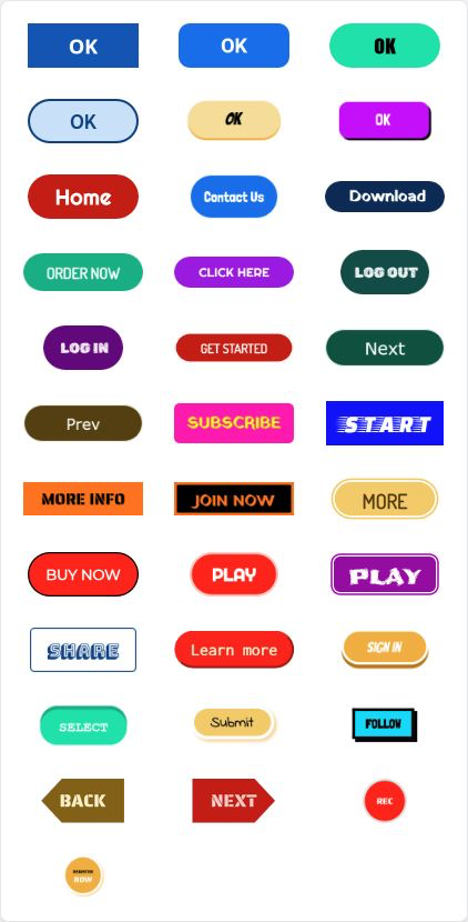
The asset appears on the current slide. Treat it as a starting design: resize and place it, then update its visible label and styling where the inserted asset allows those changes.
Choose a label that describes the outcome, such as Start lesson, Try again, View example, or Download guide. Generic labels such as “Click here” make learners work harder to predict the result.
4. Make The Button Do Something
A reusable button asset provides its visual design; it does not by itself define the learning action you need.
- Select the button object.
- Open Interactions.
- Choose the event that should trigger the action.
- Choose an action, such as moving to another slide, opening a URL, showing or hiding an object, or another available presentation behavior.
- Configure the action's target.
- Select Present and test it with the same input method your learners will use.
Keep keyboard and touch use in mind. The button should be large enough to select comfortably, its label should remain readable, and the focus or active state should not rely on color alone.
5. Keep A Consistent Visual Language
Use one icon family and a small number of button treatments in the same lesson. Reuse the same symbol for the same meaning, and do not reuse it for a conflicting action elsewhere.
When a button is part of a repeated activity, place it in a predictable location on each slide. Consistency reduces the time learners spend searching for navigation and leaves more attention for the lesson itself.
Quick Check
Before continuing, make sure that you can:
- search the icon library and insert a relevant icon;
- style and label an icon so its meaning is clear;
- insert a reusable button asset;
- add an interaction that gives the button its behavior; and
- test the result in Present mode with readable labels and comfortable target sizes.
Previous: Use Shapes, Lines, And Connectors · Next: Style And Arrange Objects · Back to Part VI · Back to the full guide