
9.2: Configure Charts
Once the data and chart type are correct, use the chart-specific properties to clarify the message. The available sections change with the selected chart type, so a missing control usually means that it does not apply to the current visualization.
In this section, you will configure titles, legends, axes, labels, line and marker styles, stacking, animation, and decals.
Before You Begin
Complete Section 9.1, select the chart, and open Properties. Select the Chart tab at the top of the pane rather than the Styles tab.
1. Set The Type, Title, And Legend
Under Classification, use the chart type control to change the visualization. Open Title to show or hide the title and edit its Content, Text Color, Font Family, Size, Position, and Align settings.
Open Legend to control its display, text color, font, size, position, and alignment. Hide the legend only when the series are labeled directly or there is just one obvious series.
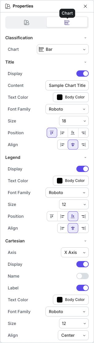
Dataset names and values are edited through Edit Data, not through a separate Series section. The colored dataset headings in that dialog identify the series colors.
2. Configure Axes
Cartesian appears for Bar, Column, Line, Scatter, and Bubble charts. Choose X Axis or Y Axis, then configure that axis:
- Display shows or hides the axis;
- Name reveals controls for an axis name and its text styling;
- Label shows or hides tick labels and provides their color, font, size, and alignment; and
- Grid shows or hides grid lines and, when enabled, provides color, width, and line style.
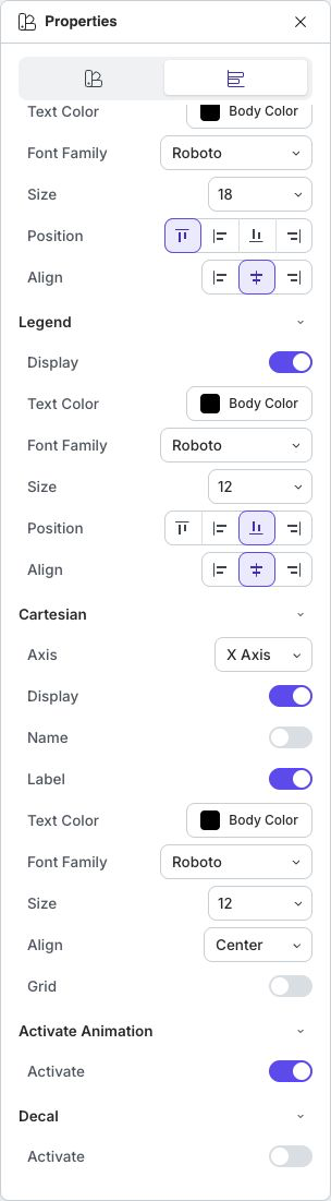
Configure each axis separately. Keep numeric scales honest, keep unit names visible when the values need them, and retain only grid lines that help a learner estimate values.
Axis Labels replaces Cartesian controls for Polar Area and Radar charts. Use it to control whether circular-axis labels appear and how their text is styled.
3. Show Data Labels
Data Labels is available for Bar, Column, Pie, Doughnut, and Polar Area charts. Turn on Display to put values on the chart, then adjust color, font, and size. The five chart types above also provide a Percentage Data option.
Use labels selectively. Showing a value on every mark can make a dense chart harder to understand; a clear axis and a few important labels are often enough.
4. Style Lines And Markers
For a Line chart, open Line to choose Mode (Linear or Curve), Type (Solid, Dashed, or Dotted), Width, Cap Type, and Join Type. A Radar chart has the same section without Mode.
Marker appears for Line and Radar charts. Turn on Display, then choose the marker type and size. Available marker shapes include circle, rectangle, rounded rectangle, triangle, diamond, pin, and arrow.
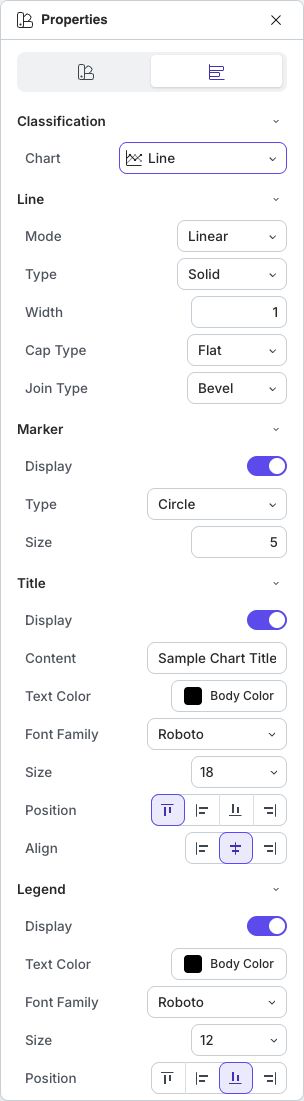
Choose a line and marker combination that remains distinguishable without depending only on color. Avoid smoothing a line when the curve could imply values that were never measured.
5. Stack, Animate, Or Add Decals
Stacked appears for Bar and Column charts. Activate it when the learner should compare totals and their components. Leave it off when precise comparison between individual series matters more than the combined total.
Activate Animation controls whether the chart animates during playback. Use animation when it helps reveal structure, then verify it in Present. Avoid it when motion distracts from reading exact values.
Decal adds patterns to chart marks. It can improve series differentiation for grayscale output or learners who cannot reliably distinguish the selected colors.
If A Setting Does Not Work As Expected
| What you see | What to do |
|---|---|
| A documented section is missing | Check the chart type. Sections such as Cartesian, Data Labels, Marker, and Stacked appear only for supported types. |
| The title or legend is not visible | Open its section and turn on Display; also check that its text color contrasts with the slide. |
| Only one axis changed | Choose the other value in Axis and configure it separately. |
| Labels are crowded | Reduce the font size carefully, enlarge the chart, shorten the source labels, or turn off unnecessary data labels. |
| Series are hard to distinguish | Use different colors plus Decal, line types, or marker shapes. |
Quick Check
Before continuing, make sure that:
- the title explains what the chart shows;
- the legend is present only when it helps identify series;
- axes include readable labels and necessary units;
- line, marker, and decal choices remain distinguishable; and
- animation supports the explanation when the chart is played.
Previous: Create And Edit Charts · Next: Build And Format Tables · Back to Part IX · Back to the full guide